Create typography to write the name of a place in a way that makes people want to visit that destination.
透過字形設計的創意,打造讓人想一探究竟的地名
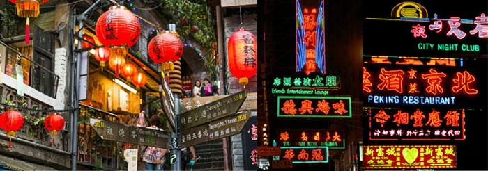
From now until the end of the year, the winter holiday season has arrived.When people go to a foreign country, they worry about being able to communicate; but in countries that use kanji, those who understand kanji can glean meanings through writing.Kanji (Chinese: hànzì, Japanese: kanji) is used in Chinese, Japanese, Korean, and Vietnamese. It is a writing system used mostly and broadly in East Asia.The blunt stops and swooping tails of kanji characters are beautiful, both the left and right sides of kanji characters have individual meanings, and there are a plethora of different types and complex forms. It is unique among all writing systems.
For this project, we are seeking typography combined with illustrations and designs for the theme of “kanji.”The theme is “Place Names.” Country, city, and region names ordinarily seen on maps are often written in dull fonts. Please try to create more interesting typography for a place name written in kanji — one that expresses its unique characteristics and invites viewers to visit.Give a standout appearance to a name that people ordinarily see on their way to school or work as they thoughtlessly glance over station signboards or maps.
The selected works will exhibit at FabCafeEnjoy playing with a different kind of alphabet by using unique typography for kanji, alongside Asian creators!
歲末年終,有沒有運用連假出遊的計劃呢?對使用漢字(中文字)的國家如台灣、日本來說,旅遊至其他同樣使用漢字的異國時。是否也有即使語言不通,但因為見到熟悉的文字出現,而感到一絲安心、並從能夠理解的字義中猜測、想像其中涵義的經驗呢?漢字(中文:hànzì , 日本語:kanji) ,被使用於中文、日文、韓文、越南文中。是東亞各地所共有的文字。漢字不僅在不同筆畫中擁有書寫的美感;單一文字的組成上,字頭與字邊也擁有各自乘載的意義。既複雜又迷人,其他文字幾乎無法與之相比。
本次專案,便是以「漢字」為核心、「地名」為主題,募集結合平面/插畫的字體設計作品。平常在地圖上瀏覽時,使用同樣字體的國名、縣市名稱、地區名稱,雖方便了閱讀,但也讓人感受不出這些名字所代表的地方特色與溫度。因此,我們想邀請你來發揮創意與設計力!將地方的風土特色融入地名文字的設計中,運用巧思,讓見到這個作品的人產生對該地的嚮往。也許是平常通勤路上再平凡不過的車站站名、地圖上的街道名稱,透過你的創意詮釋,讓我們感受這個地方的魅力!
這次的徵件專案將以台日為中心,向亞洲擴散。獲選作品也將於FabCafe展出。期待著亞洲的設計師們一起來動手挑戰設計的樂趣!


Project Outline
Project Name: Destination Names – Seeking Typography for Destination Names in Kanji!
Submission Items:
● Typography that uses kanji for a “destination name” (example: Shibuya, Tokyo, Kabukicho, etc.)
● Seeking works with photos, graphics, illustrations which includes Typography.
● When making your submission, please add information about the place in your work (prefecture name, place details, etc.).
Design Submission Period: 11/15/2016 (Tue) – 12/15/2016 (Thurs)
Rules:
File Specifications for Submissions
PNG or JPEG format / 72 dpi / RGB / 7MB or less
*The selected work will be printed on a prize, so please provide digital data.
● *If it possible your works using as material at “ZINE event” after finish this competition, please released with a Creative Commons license (https://creativecommons.jp/)
Prizes: The person whose work is chosen will receive a prize of one of the following gifts!
Tote bag / T-shirt / Hat / Keychain / Tape etc..
活動名稱:地名設計ー募集漢字地名字形設計作品!
徵件內容:
● 以使用漢字(中文字)的地名進行字形設計(如:渋谷、台北、西門町)。
● 投稿字形作品不限媒材,插畫、圖像、攝影作品皆可。
● 投稿時請附上此地名的所在位置(位在哪個縣市、地區等)、簡介
徵件期間: 2016年11月15日(二)〜2016年12月15日(四)
徵件作品規格:
檔案類型:PNG或JPEG / 72 dpi / RGB / 7MB以内
※若您獲選為得獎者,為製作獎品需要,將會請您提供ai/psd檔
※若您同意主辦單位於徵件比賽後的延伸活動“ZINE event”中使用您的作品,請標註您的創用CC授權 (https://creativecommons.jp/)
獎品:獲選人將可獲得下列其中一項產品做為獎品。
托特包 / T-shirt / 帽子 / 鑰匙圈 / 膠帶 etc…
Judge

大日本TYPO組合 Dainippon Type Organization
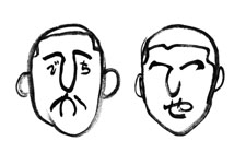
Founded in 1993 by a moustached Hidechika (no surname) and a clean-shaven Tetsuya Tsukada (surname included), the Dainippon Type Association has played around with letters and fonts with literal restlessness for 23 years. A journey of 3,000 words begins with a single character. This experimental typography group deconstructs, combines, and recreates characters in search of new character concepts. In October 2014, the association established its Character Site by Characters, for Characters type.center(http://type.center/). In 2015, it held its Ji Ji Ji exhibition at the Ginza Graphic Gallery. 1993年由有鬍子沒有姓氏的秀親和沒有鬍子有姓氏的塚田哲也共同組成。如「文字」(譯註:取日文發音的諧音)所示,靦腆地與文字遊戲23年。與文字走了三千里。將文字解體,並組合、重新建構,藉此探索新的文字概念的實驗性文字設計集團。2014年10月設立「以文字為了文字的文字網站」type.center(http://type.center/)。2015年在ginza graphic gallery舉辦「字字字」展 Website http://dainippon.type.org/

葉忠宜 Yeh Chung-Yi
卵形 OVAL Design Studio
Yeh, Chung-Yi began his studies in graphic design and artistic photography in Japan since 2007. Being a graduate of Information Design class 2012 of Kyoto University of Art and Design, he started his design studio ‘OVAL’ in 2015. He’s both the curator of importing, and translating 3 of Mr Akira Kobayashi, the Monotype Type Director’s books – ‘フォントのふしぎ’, ‘欧文書体1:その背景と使い方’, ‘欧文書体2:定番書体と演出法’, ‘まちモジ’。His latest project includes making Chinese version of Japanese typography magazine ‘Typography’. 2007年赴日學習平面設計與藝術攝影。2012年畢業於京都造形藝術大學研究所。2015年成立「卵形 OVAL」設計工作室。在策劃引進並翻譯知名字體設計師小林章的數本著作《字型之不思議》、《歐文字體1:基礎知識與活用方法》、《歐文字體2:經典字體與表現手法》、《街道文字》之後,開始統籌製作日本字體設計專業雜誌《TYPOGRAPHY字誌》的中文版。 Website http://yeh.format.com/

