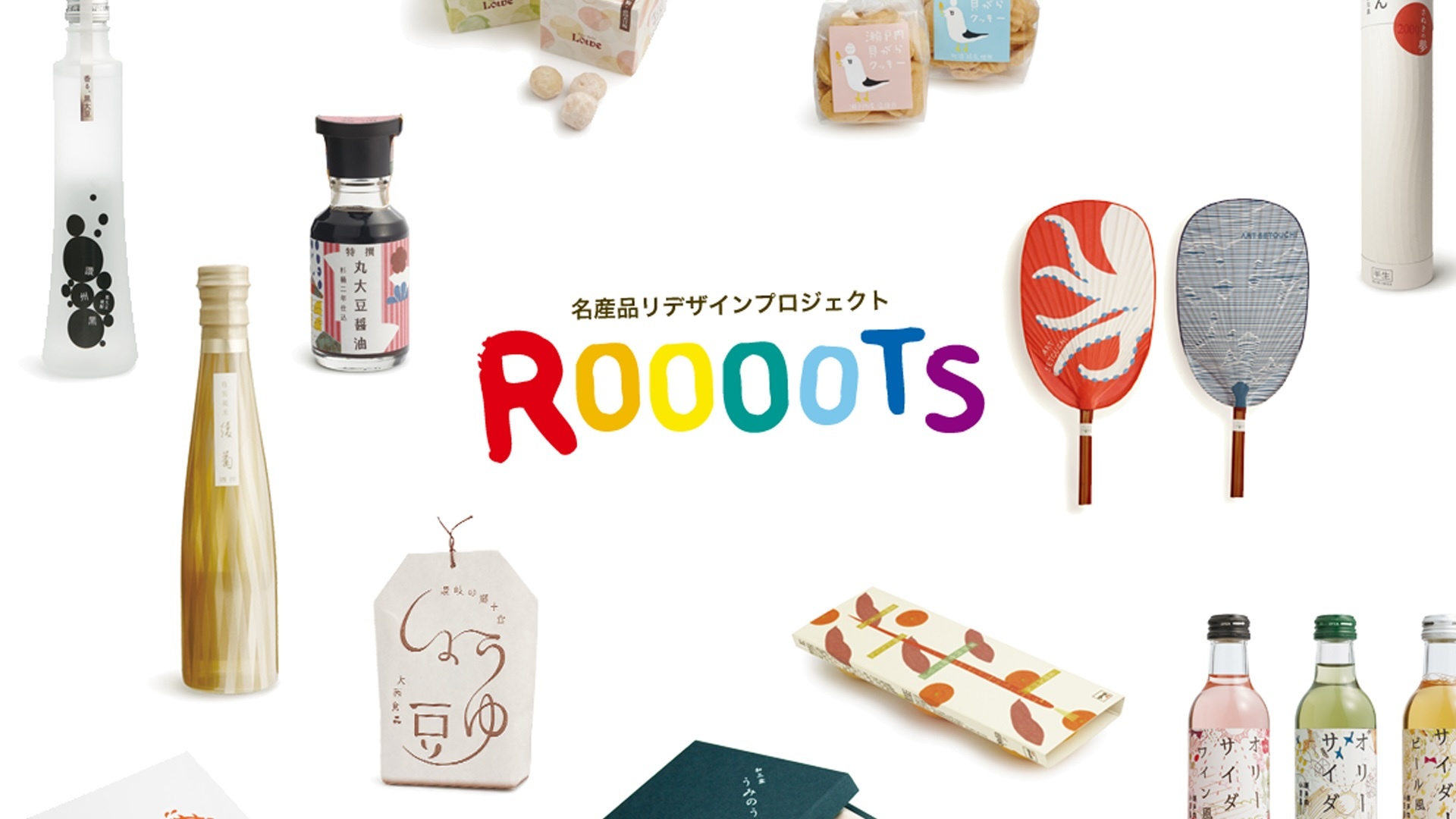
12 works commercialized at Setouchi International Art Festival 2013
We are excited to announce the winners of the Roooots Setouchi Specialty Products Redesign Project 2013, which called for revamped designs for 10 Seto specialty products in the lead up to Setouchi Triennale 2013. Our panel of judges, after much deliberation, has selected 12 entries to be marketed as original local brands.
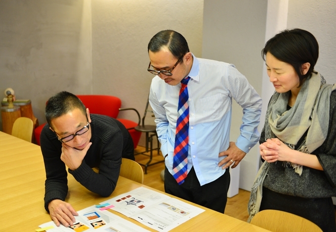
Roooots 2013 trends and selection points
The theme of tradition, handmade, new specialties, and local products that symbolize more local
This is the fourth time the Roooots project has been implemented. The redesigns were made using traditional manufacturing methods such as "tile-senbei", hand-picked olive oil, and the ancient rice liquor "Licenoir" and "Ninrigiriko Miso", which are made with local ingredients. New specialties such as All 10 specialty products carefully made by local people were redesigned.
Participation from Europe and Middle East countries-Creators of the world propose a new "Setouchiness"
The feature of this time is not only domestic creators, but also active from various countries such as Portugal, Greece, Egypt, Taiwan There was a suggestion. In addition, there were many works that had deeper understanding and consideration of the product background and producers than usual, and there were many attractive works.
Ultimately, the presentation skills at the sales floor , cost / productivity, and , above all, whether or not they had an outstanding personality , were the deciding factors for the selection, and the adoption and commercialization of 12 diverse works were decided. In addition, works that have been recruited until the end will be awarded "Work Awards" for works that have been rejected.
Selected works
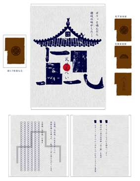
Tile cracker

Title: Upbeat Geometry Creato: Anna Kovecses (Cyprus)
Concept: We designed a modern and friendly package using several symbols such as the shape of a tile cracker. The outer box features a geometric image that resembles the shape of a tile cracker itself to a woman's face. In addition, the brand image is composed of a blue pattern pattern drawn on the inside and hand-drawn dots on the cookie surface. By fusing a handmade atmosphere with a bright and elegant atmosphere, we aimed to create a design that is loved by users. My design is a modern yet friendly packaging that works with multiple symbols including the iconic shape of the cookies.The outer box features geometric shapes, one of which is the actual cookie, while the other is an interpretation of the target audience-the face of a woman.Branding elements also include a sleek blue logo icon that repeats as a pattern for the inside and an emblem made of dots with a hand drawn feel that is embossed into the cookie simultaneously.This design aims to have an upbeat yet elegant atmosphere with a good quality hand crafted feel that helps the product get closer to the consumer.
Judge's comment: Taku Sato
A nostalgic image like a Showa illustration. There is an unforgettable strength once you see it.
Judge's comment: Masamichi Toyama
For souvenirs, it is important to have the impression that they are “cute” when handed in front of the contents. I thought it was a very impressive and interesting package that renewed the image of traditional roof tiles.
Judge's comment: Chiaki Hayashi
This is the first design work by an overseas designer in Roooots' efforts. I'm looking forward to seeing the value of the tile cracker rediscovered from a global perspective to the Japanese people again.
Kutsuwa Senbei
As a result of the judging, no works have been selected this time.
Purple sweet potato cookies
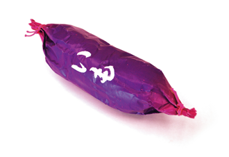
Title: Purple Plum Cookie Creator: Toshio Shigeyama (Japan)
Concept: Product wrapped in paper. The design has a simple yet impactful design to reduce the cost of the package, and expresses the potato-likeness of a dish.
Judge's comment: Taku Sato
The "texture" of the potato is just as it is and looks very delicious. While there are many “polite and easy-to-understand designs” in the world, packages that are rather blatant have a greater presence.
Judge's comment: Masamichi Toyama
The freshness of expressing potatoes in three dimensions. I want this “slightly weird” feeling to be incorporated directly into the product package. I think it would be nice to have a display that bundles and hangs the potatoes.
Judge's comment: Chiaki Hayashi
I think that it is a design that is born as a result of examining “how to convey the taste”. The taste of potatoes is transmitted visually straight.
Extra virgin olive oil
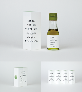
Title: EXTRA VIRGIN OLIVE OIL Creator: Tatsuro Hirano (Japan)
Concept: A simple design with only text, expressing the goodness and simplicity of the material. We emphasized that the product was carefully crafted by widening the space between the letters of the product name and letting it read slowly. The letters straddle the corners of the box so that the corners can be placed on the front, or the name of the box can be displayed by combining two adjacent boxes.
Judge's comment: Taku Sato
On the contrary, the package was as if it had not been designed. The idea of displaying the corners of a square for display is also unique. Since it is a high-end product, I want you to challenge how to devise paper and printing to create a “2,000 yen convincing feeling”.
Judge's comment: Masamichi Toyama
The simplicity that makes you think "it might be a package actually made by Shodoshima people" is good.
Judge's comment: Chiaki Hayashi
The simplicity is very good. I think it will be better if you add a story such as the background of this product and the creator's thoughts.
Tamate Box in Setouchi

Title: Iriko Ibuki Setouchi Creator: Jun Kuroyanagi (Japan)
Concept: Hang a big catch flag on the bag to inform as many people as possible of the fresh seafood delicacies. During the production, we will measure the large fishing flags remaining on the land, and use the dimensions, colors, fonts, and the strength of the fishermen to flutter a large number of “prayer flags” in the Seto with the blue sea.
* This work was submitted to “6. Setouchi Iriko”, but as a result of the deliberations by the judges, it was judged that the package of “5. Setouchi Tamate Box” was more appropriate.
Judge's comment: Taku Sato
In a world without energy, the design using the great fishing flag, which is a symbol of energy, is very good. I want you to develop it with about three designs.
Judge's comment: Masamichi Toyama
A design that seems to be "inadvertently bought". It is also interesting to display it on a sashimi-filled boat at a store. If a Frenchman inadvertently bought this and distributed it to the people of Paris, it was a great success!
Judge's comment: Chiaki Hayashi
New knowledge. At first glance it looks old, but it is novel. I felt the strength that I couldn't help but pick up. A vibrant design that lets you imagine a fishing boat with a large fishing edge and lively fish.
Setouchi Iriko
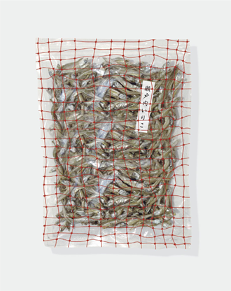
Title: Iriko Setouchi Creator: Kenichi Matsumoto (Japan)
Concept: In order to express the freshness of fish and that it is a safe material, I thought that it would be better to just drop the freshly caught state into the package design. It depends on your budget, but instead of using labels, the nets used for fishing are laid all over a transparent bag, and the design comes directly from the sea. I am glad if you can feel the richness of the Seto Inland Sea and the blessings of nature from the fish filled with the net. I think it would be effective to change the color of the net depending on the type of fish.
Judge's comment: Taku Sato
The idea of using a transparent package as a net was thought to be "killed." Because the content is the main role, it is good to be able to use the same design as it is for other products.
Judge's comment: Masamichi Toyama
While there are many works that tend to be “designs you have seen somewhere,” this work was a unique idea that you have never seen before.
Judge's comment: Chiaki Hayashi
There are a lot of fish in the net, and I'm just happy to see it. This bold idea is unique to open recruitment.
Wanbon Sanuki's Lemon, Sanshu Daikoku
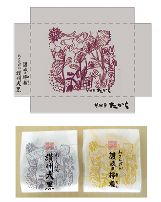
Title: Sanuki-grown sweets Creator: Mariko Terai (Japan)
Concept: Drawing on the blessed climate of Setouchi, using the design as it was. In the gusset bag, the picture is arranged in a color close to the material to complement the material. Boxes and bags are printed with foil stamping if possible, and we hope to create a more exclusive and special finish.
Judge's comment: Taku Sato
There is good point not to make people nervous.
Judge's comment: Masamichi Toyama
A warm design that has a modern taste and is likely to be loved by a wide range of people, from young to elderly.
Judge's comment: Chiaki Hayashi
I thought that the soft atmosphere was perfect because it was a snack for relaxing time.
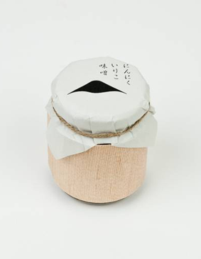
Garlic miso miso
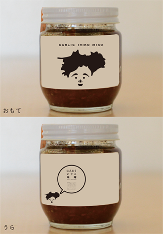
Title: Kao Shikoku Creator: Tomoyo Sakai (Japan)
Concept: Garlic is designed to reduce the smell, so we tried a design that didn't feel too much garlic and that the younger generation could easily pick up. Since it is from Kagawa in Shikoku, surreal characters are placed on the table with the silhouette of Shikoku as a point so that it can be clearly understood. The face parts are garlic and garlic of the product material. Literally, we wanted to make the product look like the face of Shikoku. We wanted to give the front a stylish look, so we avoided icons as much as possible and turned them into icons, and on the back we put product descriptions on the back.
Judge's comment: Taku Sato
The face is simple and monotone, but very memorable. In addition, not only Kagawa, but also the decisiveness of saying "Shikoku kao".
Judge's comment: Masamichi Toyama
It is interesting to see the outline appearing in the eyes even though there is no outline of the face.
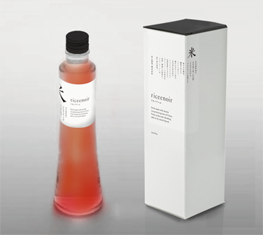
Lysenoire
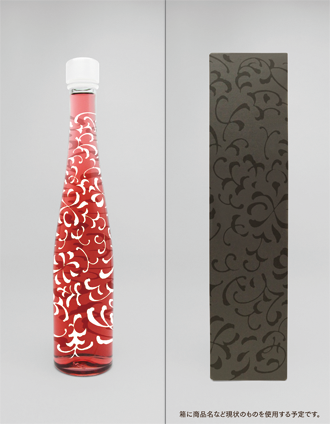
Title: Lice Noir Creator: Jun Kuroyanagi (Japan)
Concept: Based on the concept of `` rice flowers, '' we collect letters and characters that represent the liquor called lisenoire, such as ancient / daily / rice / ca / wind / earth / people / courage / heart / beauty ... The entire bottle is worn as an arabesque pattern that symbolizes “life force”. The collection of letters transformed like a plant shows a pattern of "fermentation" vigorously, with each new connection emerging.
Judge's comment: Taku Sato
The product name of a regular sake bottle tends to be "Dokan", but the other design is fresh and interesting.
Judge's comment: Masamichi Toyama
I was attracted to the gorgeous design that reminds me of flowers rather than rice.
Judge's comment: Chiaki Hayashi
From a woman's point of view, I thought, "This is it!" You can imagine the gorgeousness, the taste and the pleasure of drinking this sake.
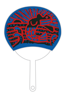
Marugame fan
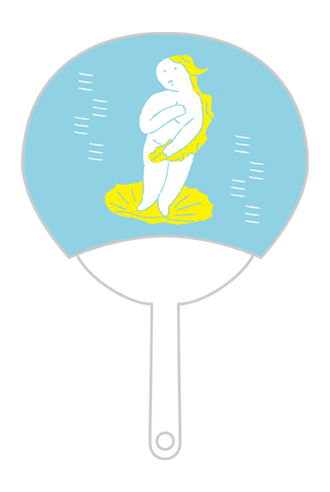
Title: Setouchi Venus Creator: Hiroya Kaya (Japan)
Concept: The theme of this painting is the gentle Seto Inland wind and the theme of Venus, which is based on the motif of the painting of the birth of Venus, which is easy for everyone to recognize. Also known as the Setouchi International Art Festival, the art that will be born from now has the meaning of birth.
Judge's comment: Taku Sato
I like the expression is so cute and it's very strange.
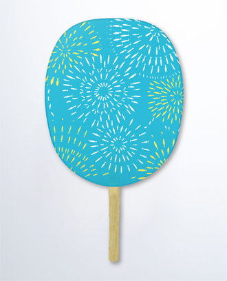
Title: Hanasakana Creator: Hideyuki Kumagai (Japan)
Concept: This is a fireworks display of fish swimming vigorously in the Seto Inland Sea. Fireworks that add flowers to the art festival are launched. Tamaya.
Judge's comment: Chiaki Hayashi
The combination of Seto Inland Sea fish x summer fireworks is unique and refreshing.
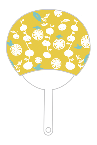
Title: Tangerine Creator: naginohi
Concept: A design that expresses tangerines that grew in the warm sunlight of Setouchi. The birds are also gathering in the fragrant tangerines.
Judge's comment: Chiaki Hayashi
In a simple design, the sweet and sour of tangerine in Setouchi is expressed.
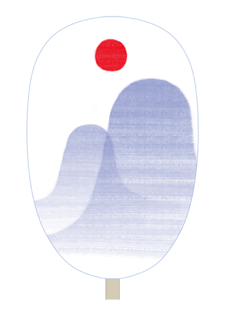
Title: Sunset and Mountain Creator: Gustav Klim
Concept: “What is this?” “The most beautiful sunset in Japan (pride), the unique mountain (identity) that protrudes from the plain like a bump, and the wind. "Eh! Is Setouchi so windy?" "No, no, this fan. It's completely different! ''
Judge's comment: Masamichi Toyama
It is very beautiful. I wanted to bring this home
Prize for work
This time, I missed the adoption, but it was a very highly appreciated work.
Judge's message
Taku Sato
This time, there were a lot of elaborate works, and many unique proposals that could not be easily produced by general marketing methods. From the richness of the work, it has been conveyed that the applicants are learning properly while referring to the products formed in the past Roooots project. The works that have been adopted are also very varied, which seems to be Setouchi. I'm looking forward to it.
Masamichi Toyama
The level of entries is high, and I feel that the selection has finally settled down where it should be. It was good that we were able to select the products without having to be constrained by the appearance of the design, but imagining the sales floor and the scene of the purchase.
Chiaki Hayashi
Every time the Roooots project is recruited, there is always an intuitive suggestion that this is going to happen, and in fact they have been successful. In this fourth public offering, there were also new ideas and discoveries that were exciting. I am very happy that the applicants always treat Roooots with fresh feelings.
