Touch the story behind the product and add the charm to the package
The "USIO" project symbolizes the rich tide where tides meet. There are many applications not only from Ishigaki Island and Japan but also from overseas including Taiwan, and 431 works that express the background story and the creator's feelings from a wide range of applicants from students to professional designers. Gathered.
Judges from around the world from different perspectives
All are novel and attractive works. Some designs were decided immediately by the unanimous decision of the judges, but opinions were divided until the end. There were also products.
It was not easy to come to a conclusion just because there were many excellent designs, but there was one aspect of the regional × design approach. Judges from the base field of each judge mixed with "Japanese design seen from Taiwan", "design not born in Tokyo", "a private house like Ishigaki" ... and it became a very interesting jury. Was.
Ultimately, the expression skills that faithfully incorporate the features of Ishigaki Island, the ability to present to targets in anticipation of domestic and overseas, the balance between the manufacturing method and the cost of presenting the supplier, and above all, the distinctive personality that makes the judges judge quickly The following ten points have been decided.
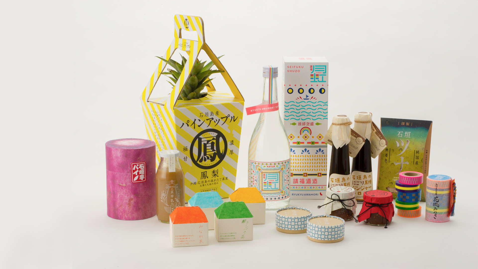
Selected works
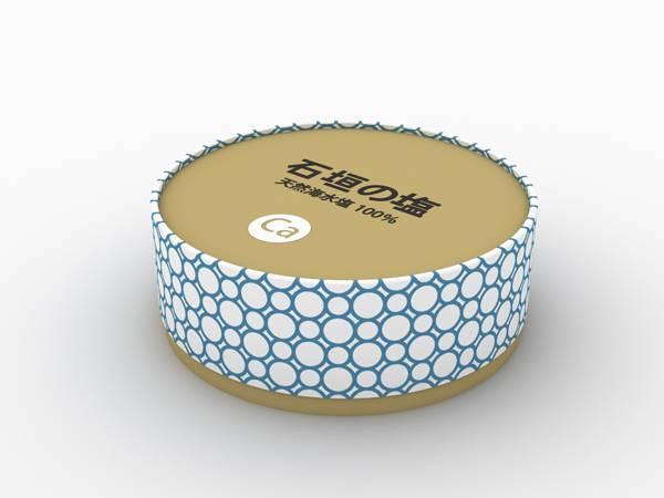
Title: 01. Ishigaki salt
Creator: IDEA N DESIGN
Concept: A motif based on a salt crystal lattice. Since seawater salt is also a marine product, the expression "sea-like" or "beach-like" was used. To give the exterior a high-quality feel, we propose a column made of paper like a Camembert cheese box. If moisture control is required, pack the salt in a plastic bag inside the box.
Judge's comment: Toshima Keizai Shimbun Mr. Kuramoto
Every island has souvenirs of salt. Therefore, it is very important that at least “Ishigaki Island” stands out, and it is good for the design to be suitable for young people.
Judge's comment: Mr. Chen, Taiwan Design Center
The pattern on the side looks like a yukata and feels like a Japanese style. There are not many packages of such salt, so I think it will have an impact. Gives a modern feel.
Judge's comment: Smiles Toyama
It has a high-class feel that has the power to line up with high-end supermarkets in urban areas. It has a high quality design that you will want to keep at hand when cooking in the kitchen.
Judge's comment: Loftwork Hayashi
It's very simple but easy to use and I want it myself. I want to buy a souvenir and go home.
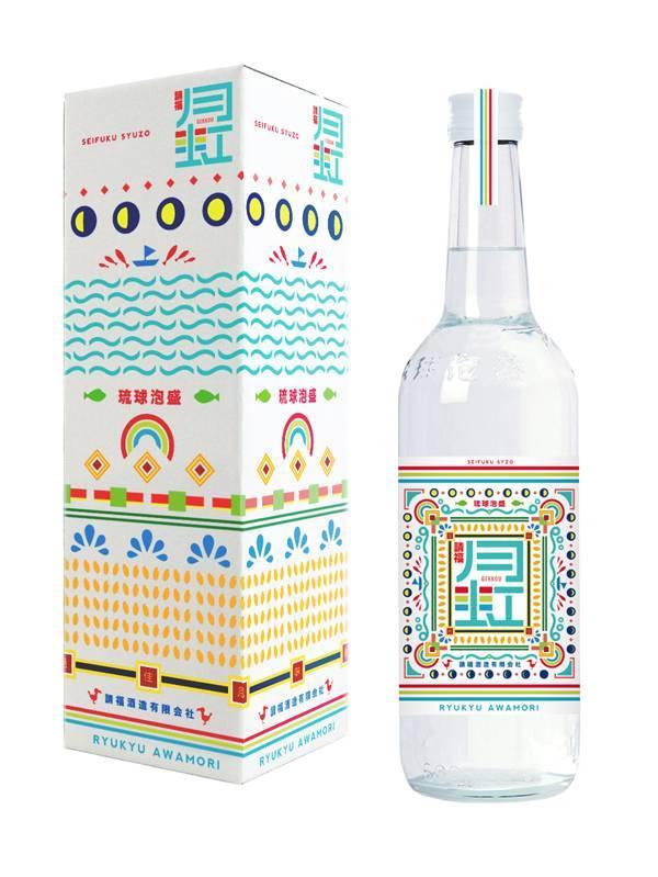
Title: 02. Ryukyu Awamori "Moon Rainbow"
Creator: Yoshitaka Hamuro
Concept: In the moon cycle of 30 days, everything is condensed from the sky to the sea, from the sea to the island, from the island to the material, and to Awamori (moon rainbow), and one Awamori is completed It shows the situation.
Judge's comment: Remote island economic newspaper Mr. Whalemoto
There are all kinds of sake on the island, but it is impressive with a design that has never been seen in island shochu or Ryukyu Awamori. If you look closely at the package boxes, it is very interesting that the details such as the phases of the moon and the waves are also designed.
Judge's comment: Mr. Chen, Taiwan Design Center
There are indigenous peoples in Taiwan, but they resemble their ethnicity. I think these patterns have a strong traditional image
Judge's comment: Smiles Toyama
Design that is not easily born in Tokyo.
Judge's comment: Loftwork Hayashi
All members of the jury agreed. Evidence that stood out among the many entries.
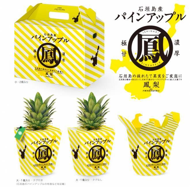
Title: 03. Pine Apple from Ishigaki Island
Creator: Ishigami Akiyoshi (Graphika Inc.)
Concept: Designed to be widely recognized as a pine apple from Ishigaki Island, including its packaging. I hope that it will make a distinction from other production areas without using pine apple photos and illustrations, and give the viewer an impression as a package that makes use of the unique characteristics of the fruit itself. As a design symbol, the character “Hara” of the pine apple kanji “Otori” is placed in the circle, and the silhouette of Ishigaki Island, the production area, is placed on the side with a point. In order to have you return with the fruit of the island, the package containing 1 is a package that puts out the crown bud (upper green part) as it is and carefully covers the fruit, and is designed with the fruit (crown bud) included . I would like to attach a two-fold paper tag (outside, window color / middle surface, yellow color) to the crown bud part and write down the history of pineapple on Ishigaki Island, why it is sweet and delicious, and the producer's thoughts . The two boxes are made of cake-like cardboard, and have holes on the sides. The aim was to design a freshly picked “island fruit” with bright yellow stripes and symbol logos to enhance branding and recognition, and to design a souvenir so that people inside and outside the island can take it home.
Judge's comment: Toshima Keizai Shimbun Mr. Kuramoto
It's cute and it seems to protect the pine as a structure, so I don't want to hurt to take it home.
Judge's comment: Mr. Chen, Taiwan Design Center
Pine apples are abundant in Taiwan and Southeast Asia and need to be differentiated.If it is better to add the image of Japan in addition to the regional characteristics, in Taiwan the typography encircling kanji feels "Japanese" So good. In addition, the pine of the stone wall feels beautiful because the leaves are well arranged, so it is a design that can make use of it.
Judge's comment: Smiles Toyama
I think it's too fashionable and interesting. If you clear even the functional parts such as attaching a string so that you can easily take it home, when you give it as a souvenir, it feels like "oh" and it seems that it will sell.
Judge's comment: Loftwork Hayashi
It is obvious at a glance that the leaves that come out of the individual package are pineapples. Still, the excitement and quality of the souvenirs are added, making the dress simple but effective.
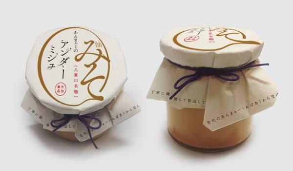
Title: 04. Yumiso "Anma no Under Mish"
Creator: Honda Atsushi
Concept: Because the product is made by human hands, we thought of making the package “wrapped in paper and tied up” as a package. Also, since the size of the container is small, the product name is written on the wrapping bag, and the design is in Japanese so that it can be used in future developments.
Judge's comment: Remote island economic newspaper Mr. Whalemoto
Ayumi miso is abundant in other areas, so it is necessary to differentiate between the Yaeyama Islands and Ishigaki.
Judge's comment: Mr. Chen, Taiwan Design Center
The word “Miso” is well understood by Taiwanese, so this design is easy to understand. There is also a sense of luxury.
Judge's comment: Smiles Toyama
Originally, it may be an image like a miso pot. This character gives a sweet impression. Since the paper packaging will be removed first, it may be necessary to adjust the condition of the skin, use a cap, and so on.
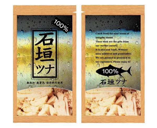
Title: 05. Really Serious Tuna Flakes
Creator: Huang Takatada
Concept: We shortened the name and added “100%” to make it easier for consumers to remember the product. The most important message of this design is freshness. The water droplets on the tuna skin are reminiscent of a fresh fish market. To make it more realistic, photos are placed at the bottom of the package so that the contents can be seen at a glance. The fish skin and meat were surrounded by a woodgrain pattern to give the image in a wooden box. It expresses how natural and special this tuna flake is.
Judge's comment: Mr. Chen, Taiwan Design Center
I think that it is good that the design is so clear that it is fresh. There is also a sense of luxury.
Judge's comment: Smiles Toyama
A mysterious design that gives the impression of a universe. There is a sense of luxury, so it may be easy to put it in a luxury supermarket.
Judge's comment: Loftwork Hayashi
When expressing fish skin, it may be better to adjust the grotesque a little more. However, I think that this design can express the fact that it is a fish while maintaining the realism, without making it uncomfortable. This time, emphasis was placed on feasibility in the retort pouch manufacturing method. Looking forward to the brush-up version.
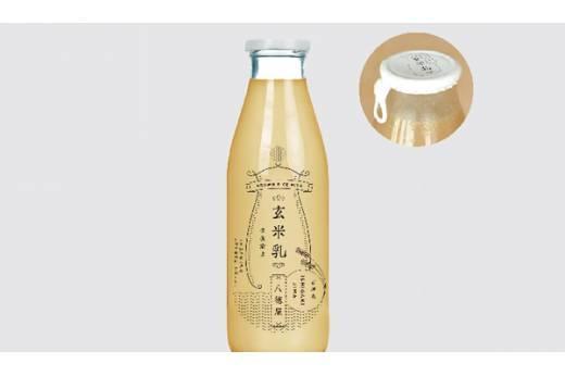
Title: 06. Brown rice milk
Creator: Honda Atsushi
Concept: A line drawing composed of lines that represents the sea and the sun of Inaho and Ishigaki, which symbolize brown rice, and is appealing as a brand name and brand logo that represents a nostalgic appearance and a brand that is known to be Hatokuya's brown rice milk. I designed it to do it.
Judge's comment: Mr. Chen, Taiwan Design Center
A design that emphasizes traditional manufacturing methods.
Judge's comment: Smiles Toyama
After drinking for the first time, I was surprised at the taste, "It's delicious," and wanted to definitely try it in Tokyo. From this point of view, I chose this design, which has a classy feel and a design that can be used in Tokyo.
Judge's comment: Loftwork Hayashi
The good point is that the design is made up of high quality by taking advantage of the simpleness of the materials and the design constraints of single color printing.
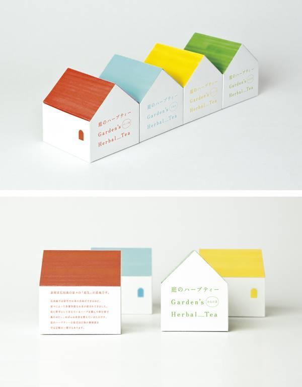
Title: 07.Shirahonoshima herbal tea
Creator: Tatsuro Hirano
Concept: A wide variety of herbs grow in the garden of a private house, and they have been drinking it as healthy tea for a long time. I thought it was a very rich thing and a strong originality like no other product. Therefore, the naming is straight "herbal tea in the garden". I thought that if I dared to add the conjunctive "no" instead of "herbal tea" and make it look like a spoken language, I would be able to feel the producer closer. The package is in the shape of a house. The color of the roof varies depending on the type of tea, and the arrangement of multiple pieces of tea expresses the culture of Ishigaki Island, where houses have a wide variety of teas.
Judge's comment: Toshima Keizai Shimbun Mr. Kuramoto
A design that sells. Because it is made carefully by the hands of grandmas, so if you can brush up this roof or the side of the house into a design like a house in the Shiraho village, it will be more unique and unique here I think it will be.
Judge's comment: Mr. Chen, Taiwan Design Center
"Picked from the garden" is a very good story, so a work with that image is good. There are many kinds of tea, and other works are not much different from what is available now, but this seems to have a story and makes you want to drink.
Judge's comment: Smiles Toyama
This is a good design to be a present.
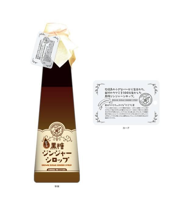
Title: 08. Yuki's brown sugar ginger syrup
Creator: Yoshiro Nakagawa
Concept: The main body label is designed to be liked by women with cute decorations and curved cuts. Labels are assumed to be paper with a warm texture. The overall color of the warm colors gives a delicious impression and a gentle impression that makes you feel relaxed, and the titles written in Japanese are simply arranged so that the product names can jump right into your eyes. By attaching a card, we also thought that the “delicious taste of Nigori” and the “handmade recipe” can be conveyed to consumers in a polite and easy-to-understand manner.
Judge's comment: Remote island economic newspaper Mr. Whalemoto
The story comes in the form of a label, which is a good trick to "get attention." I think that detailed information and stories are often preferred by women and will be repeated. I'm glad if I get it honestly, and I'll be happy as a present.
Judge's comment: Smiles Toyama
A sweets-like impression that makes you want to put it on a hot cake is good.
Judge's comment: Loftwork Hayashi
The image that a woman buys as a souvenir and returns is exciting. I think women like things with information. Since the impression is a little closer to the current line product, we would like to consider the unique differentiation points of “Nigori”.
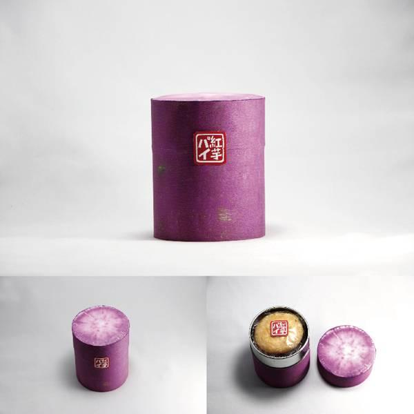
Title : 09. Red sweet potato pie
Creator: Keisuke Shunsuke
Concept: Promoted the greatest appeal of this product, the deliciousness of the potato itself. The figure of Oki Yume Purple, which has a beautiful purple color up to the cut, attracts people by itself. We also recommend using cans instead of paper and boxes, as the souvenirs of the “reservation” and “reservation” factors are very important. I tried to design not only sweets but also sweet potatoes.
Judge's comment: Remote island economic newspaper Mr. Whalemoto
It feels like it can be used for something later, and the unique design is unique.
Judge's comment: Mr. Chen, Taiwan Design Center
The idea is very interesting. There is no need for explanation, and there may be a sense of luxury.
Judge's comment: Smiles Toyama
Because it's a great deal, simply print as little as possible so that the sticker can be removed so that you can put it in a container later, so that you can keep the memory of this stone wall on the desk forever ... package.
Judge's comment: Loftwork Forest
It is straight like cutting a red potato, and the cut as a design is good.
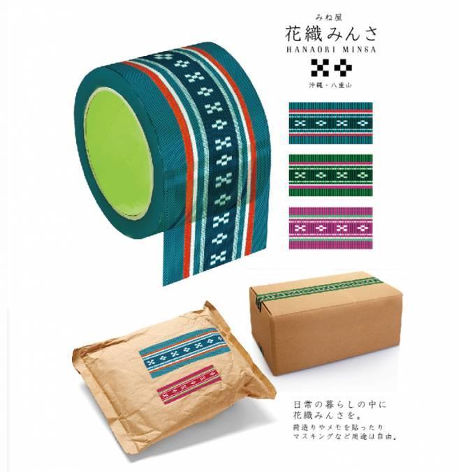
Title: 10. Minori Kaori
Creator : Ishigami Akiyoshi (Graphika Inc.)
Concept: I made it as “Minori Kaori” in everyday life, and hope that it can be applied to tapes that I usually use casually. Among these tapes, we thought that it would be possible to print a Minsa pattern print on a curing tape that is woven of polyethylene fiber and used for a wide range of purposes. Making the most of the characteristics of the original tape woven horizontally and vertically, even if you print it, you can enjoy the charm of `` Minsa '' for a wide range of people regardless of age and gender, such as moving or packing, without impairing the texture of the fabric. think. We hope to be able to sell it together with the drawstring to put the tape.
Judge's comment: Remote island economic newspaper Mr. Whalemoto
Locals and stylish shops in the stone walls can be used for a short while with the packages there. A unique idea in expanding the base.
Judge's comment: Mr. Chen, Taiwan Design Center
At the Museum in Taiwan, there are original goods with print tapes of old red seals, which have become booming enough to sell tens of thousands a month. This tape will love that story too.
Judge's comment: Smiles Toyama
so interesting.
Judge's comment: Loftwork Hayashi
Although not a real Minsa weaving, it is an interesting approach in terms of branding of Minsa. If this tape triggers the popularity of Minsa weaving, I feel that it has potential as a method to increase the needs of textiles in general, where it is difficult to develop new products in terms of price.
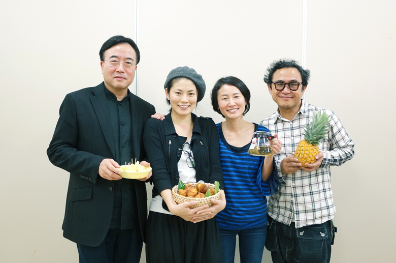
Judge comments
There were works that looked at Ishigaki from various directions, such as "Ishigakijima" from Taiwan and "Islanderness" from Tokyo, and it was very interesting. There are things made from various angles, and I think the stone walls will also be delighted. (Mr. Kuremoto, Remote Island Economic Newspaper)
I felt it was a good attempt. Things that are different from the design of Tokyo and the city, and that make use of the goodness of the remote island of Ishigaki Island, will gather properly, and I think that realistic good things will be completed. Maybe their sales will increase. (Smiles Toyama)
With the theme of Ishigaki's tradition of special products, designers from Tokyo and Taiwan and various other regions have made suggestions. In this judging, there are many works with high degree of perfection, and it is very meaningful that the designers participated in the design with an interest in the remote islands, and it became very important for us to study and learn I hope to make things in Taiwan. This examination is only an intermediate stage, and it is expected that even better designs will be born by having the designers further refine the selected design and actually negotiating and adjusting with the manufacturer. (Mr. Chen, Taiwan Design Center)
It was the first time to judge a specialty of Japan, including overseas judges, but it is the same as not knowing my goodness unless I was pointed out by others, so it was surprisingly myself to find out what is Japanese like Then I felt it was something I couldn't understand. This time, I was conscious of reviewing the appeal of Ishigaki from an outside perspective, and in the process, there was something called "Ishigaki's perspective from Tokyo" and "Japan as seen from a country other than Japan" The appeal of "was discovered through the examination." Works from various areas of Japan and Taiwan were selected, but what kind of conversation they would actually have when they gathered, how they will interact with Ishigaki and how the design will be refined in the future Very fun. (Loftwork Hayashi)