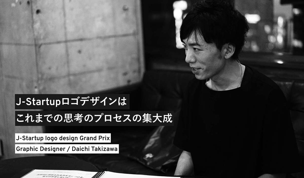
This is an interview of Daichi Takizawa, the winner of the “J-Startup” logo design contest held by the Ministry of Economy, Trade and Industry.
Daichi mentions that out of the many design competitions he has participated in up until now, he could feel from the moment he submitted his logo that this was the most confident he had ever been. Daichi’s strong desire to continuously challenge himself and the status quo could be seen through these words.
I aim to be a versatile designer.I use awards to test myself.
ーWas there any inspiration for your first logo design you submitted to J Startup?
For competitions, there isn’t a client to work out ideas with. All you have is what is on the official homepage or AWRD, so I spent a lot of time poring through these websites to get as much information as I could.
I focused on finding their “message.” Through doing this, I realized there was a strong emphasis on “providing innovation to the world” and “turning trends into culture.” I used these two key-words and J-Startup’s role to come up with the concept “a compass that opens the future,” which I designed the logo around.

Concept:
I call this logo the “J-ship,” which embodies three different motifs:(1) The needle of a compass,(2) A ship setting sail to go abroad, and (3) The shape of the J from J-startup.I used red to represents Japan and innovation, to symbolize how Japanese venture companies will make their way into foreign markets through a variety of different channels (services, products, etc.)
I arranged the logotype around Copperplate, a font born from the age of copper plate printing. This was to show J-Startup’s desire to “turn trends into culture” through using a font associated with printing, an integral technology for sparking a revolution in knowledge for mankind. These two concepts were used to express innovation and tradition for the logo.
ーSo the idea of using a compass as a motif came from two key-words.
That is right. At first, I played around with the idea of using the rising sun, like on the Japanese flag, for my design. I tried gradually changing the red to blue, like on the client’s homepage.
When I saw the Japanese phrase Sekai ni Tobidasu, which means to jump out into the world, I thought that maybe a boat would be a good way to express this. I made a few rough drafts, but was worried that this might be too cliché.
That is when I started to focus on different parts of a boat, like the rudders and the sail. I kept breaking down what can be found on a boat, which brought me to the needle on a compass. After trying a few different patterns, I cut off the left side of the needle. This made it look as if the color was blown out by reflecting light.
I thought this was interesting and decided to use this as the motif for the logo, and went with red for the color to associate the logo with “Japan” and “innovation.”
ーHow long did it take you to design the logo?
Time was very limited, with only two weeks to submit the application, so I only spent about ten hours designing the logo itself. The rest of the time I spent entirely on thinking of ideas.
ーHow did you feel about the contest after participating?
I was obviously elated that I won, but working within the guidelines for the logo and fixing minor details turned out to be an invaluable experience for me. This is something I couldn’t have experienced if they didn’t choose my logo design, and was glad to be able to experience this.
ーI know the contest has only just ended, but has anything changed for you after winning?
To be honest, I was very confident that my logo design was going to be chosen. I knew I was almost there when the officials contacted me about making it to the finals, and was pumping my fist when they contacted me about the winning.
Winning the award has become a big confidence boost. I didn’t study design at a formal art university or worked for a design firm, so I had somewhat of a complex about whether my designs were really good enough, which made me doubt myself a lot. Winning this award has cleared any doubt I had about my ideas, and made me more confident that I could make it in the design world. This has been an invaluable experience for me.
Daichi used this complex as fuel to continuously challenge himself. He set to overcome challenges with his own will and strength.
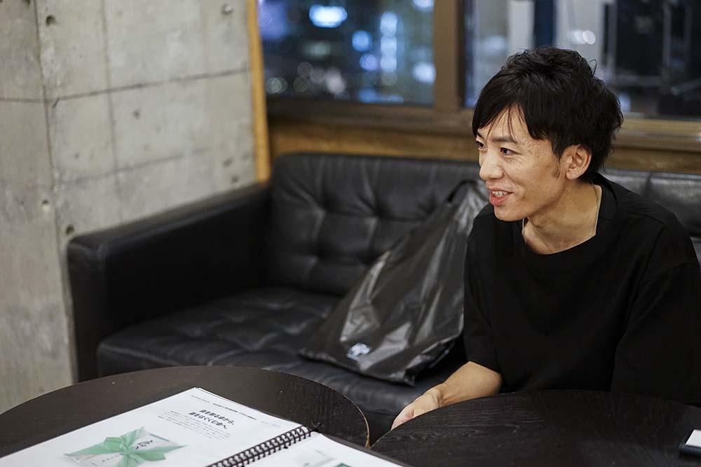
ーTell us why you wanted to become a designer.
I always liked drawing pictures. I admired the worlds in games like Final Fantasy, so I used to draw them as a hobby. While I always thought it would be fun to do what I love for a living, I decided to try and get into a regular university when I was in high school. It was when I was taking time off to study for university entrance exams that I realized my I wanted to pursue a career in design, where my passion was, and the changed direction I was heading.
My parents, however, weren’t enthusiastic about the sudden shift in directions… lol
They ended up “not agreeing with but supporting” my decision. That being said, they were very happy when they found out about my design being chosen for the award, and I felt like I was finally able to pay them back for their support.
Resolving Social Issuesー What I Have Come to See Through Design.
ーI understand you went to design school after graduating from Gakugei University.
I was studying design at Gakugei University, but as the school is geared more towards education majors, so was their art curriculum. It wasn’t much compared to studying art at proper art university.
This became somewhat of a complex for me, and after I graduated I continued to takes courses taught by an active art director at a design institute once a week for a year. After I finished there, I started taking courses conducted by Sendenkaigi, a famous Japanese marketing communications publishing company, on how to become an art director.
ーWere there any classes that left an impression on you?
The final project for the art director courses, which was overseen by Satoru Miyata from Draft (a Japanese Design Firm), was to solve social problems from our home towns using design.
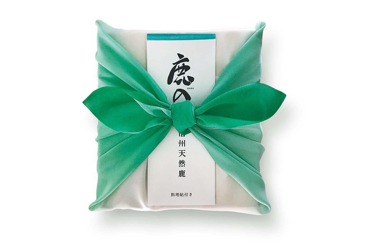
I went back home to Matsumoto City in Nagano Prefecture and headed straight for the city office. After doing some research, I found myself face-to-face with a problem. I proposed solutions to this problem through the design below.
<Shinshu Natural Venison “Kano”>
Comment:
30 thousand deer are hunted and killed every year in Nagano to prevent deforestation. At the time, only 5% of the meat gathered from the deer was being sold, resulting in a situation where a lot of “lives are going to waste.” I proposed creating an antenna shop to sell deer meat and increase awareness about the issue. I defined venison as a “gift from the forest,” that through buying, consumers could both support hunters and the forestry industry, and play a part in protecting the forest. This project was a good chance for me to realize the importance of learning about issues and how interesting it was to solve social issues.
I learned from this experience how interesting it was to “discover problems” and that “design could be utilized even to solve social problems.”
ーCan you introduce us to some other projects you worked on?
This is an example of the design for educational sales tools I did for work.
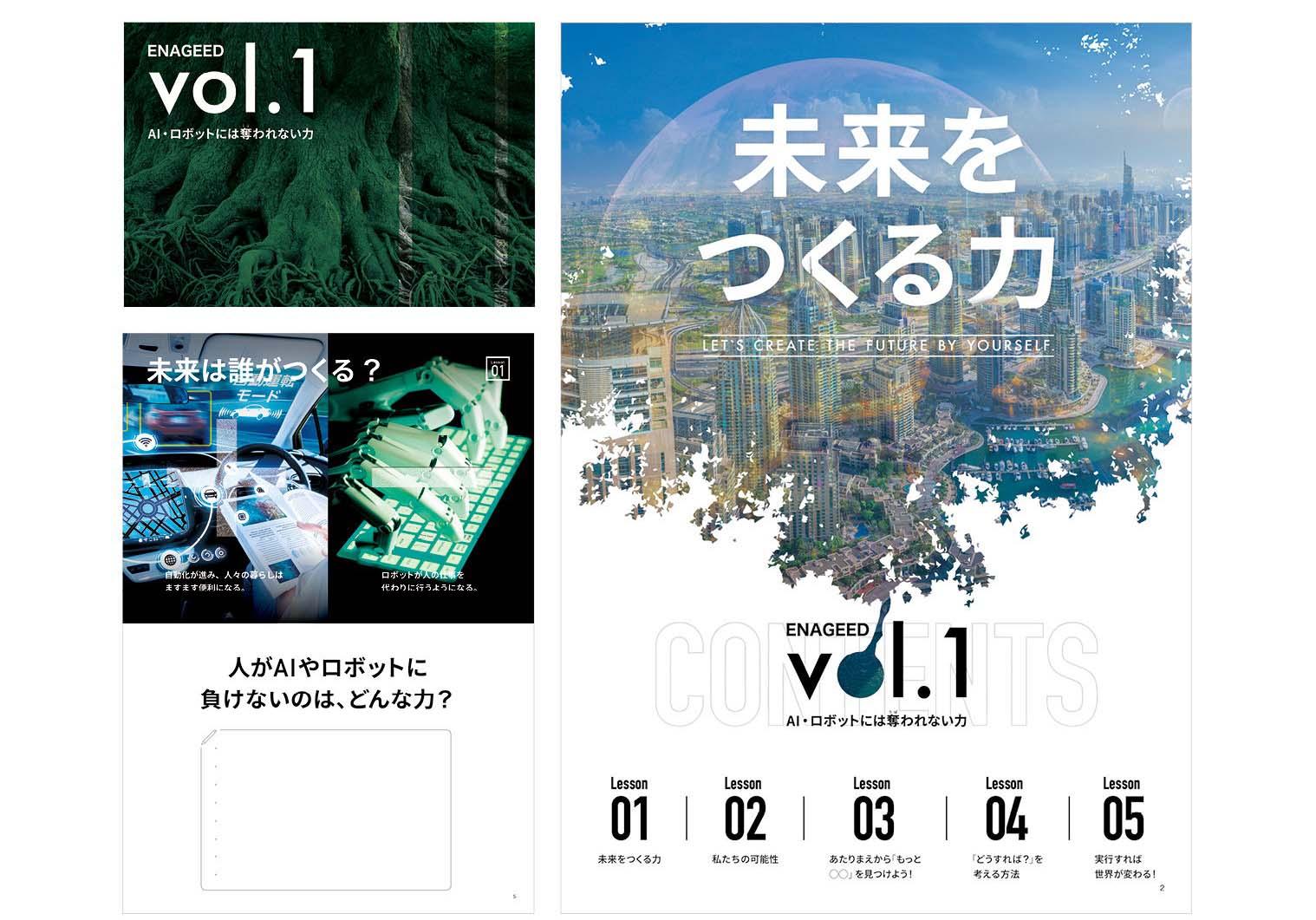
Comment: This textbook was used to learn about what the future is predicted to hold and about skills, such as problem solving, that would be valued in the next generation. Students use the work outlined in the book to discover the process of creating methods to actively seek out problems around them, come up with ideas to solve the problems, and actually solve the problems. They were sold directly to high schools, universities, and cram schools, and incorporated in over 100 schools in 2 years.
ーAre there anyways practice to improve your design on a daily basis?
I read a lot of books about design. Most of them are written by art directors such as Kashiwa Sato, Kenjiro Sano, Manabu Mizuno, etc. It is great practice to improve how you think, rather than how you express concepts. I feel like the results of my practice shown through for this design.
ーThere are definitely things you can learn from books
Yeah, there are a lot. I personally like Kashiwa Sato and have read his book, “Reaching the Essentials (Cho-seirijutsu)” several times. The book goes over the process of taking a lot of information, organizing it, slimming down it, choosing important parts, and refining them. When I first read it, you could say it was a real eye-opener. I thought to myself, “Ah I see, this is how I need to think!” It made a lot of sense to me. This has been the core of my though process ever since. Part of why I went to the Vantan Design Institute was to confirm whether this core was right by doing a project with an active art director.
ーTell us about a project or something you would like to challenge yourself next.
I would like to win an advertising award. I have yet to leave a mark with advertising so this is something I have a strong desire to challenge myself at.
ーTell us some advice or a message you have for people who are thinking of challenging themselves participating in competitions.
I would like to tell them to “create designs that convey messages in an instant.” The judges examine an incredible amount of designs, so they only have a few seconds to look at each of them. So I believe it is important to think about how you can convey a message in a short amount of time. In order to do this, I think it is important to “have a clear concept” and a good idea of “what people who see the design will think in an instant.”
Profile
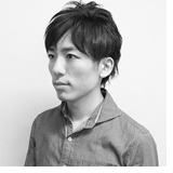
Daichi Takizawa
Born in 1985, Graduated from Tokyo Gakugei University, Art Major. After working in-house for a cosmetics company and a design firm, joined the Enageed Inc. in 2015 as a general designer working in graphics, editorials, sale promotions etc.
URL:https://awrd.com/creatives/user/2910006
【Related Websites】
■J-Startup Official Homepage:https://www.j-startup.go.jp/
■J-Startup Award Details:https://awrd.com/award/jstartup
■J-Startup result report:https://awrd.com/blog/2018/8/repo-jstartup
Written by

reiko shinohara
AWRD編集部 / PR、ライター
デザイン、アート、ライフスタイルにまつわる分野でライティング、コミュニケーション活動を行う。 群馬県富岡市出身、O型、うお座、動物占いは ひつじ。
