The platform AWRD, which connects creators with projects, has launched a new interview series titled “AWRD meets GLOBAL CREATORS” (#AMGC).
With the theme of “New Sensibilities,” the series spotlights emerging designers, artists, and creators from diverse fields across the globe, delving into their creative practices as well as the unique cultures of their countries.
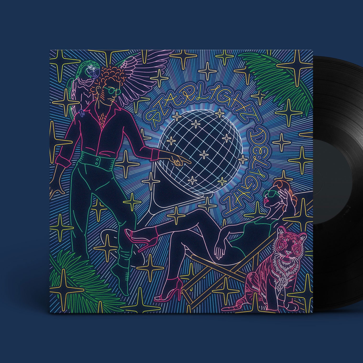
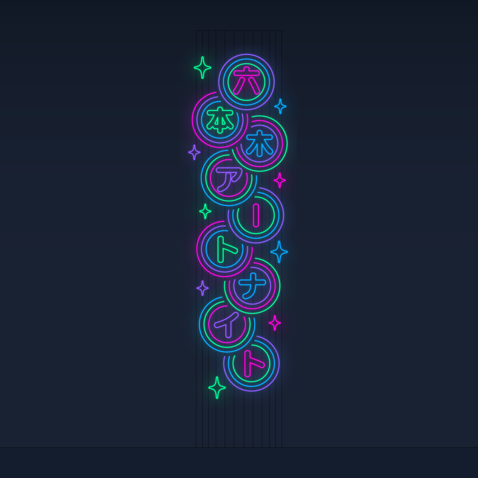
For the 11th installment, we feature Taiki Okuyama, an art director and graphic artist. His creative practice spans from loop animations and installations inspired by the flickering of neon signs, to projects ranging from cultural and artistic endeavors to global brand collaborations. Through his work, he presents distinctive visual experiences that connect people, cities, and communities. In addition, he is scheduled to unveil a large-scale installation at Roppongi Art Night 2025 this September.
In this interview, we explore the background that shaped Okuyama’s expression, his creative process, and the new frontiers he is preparing to challenge.
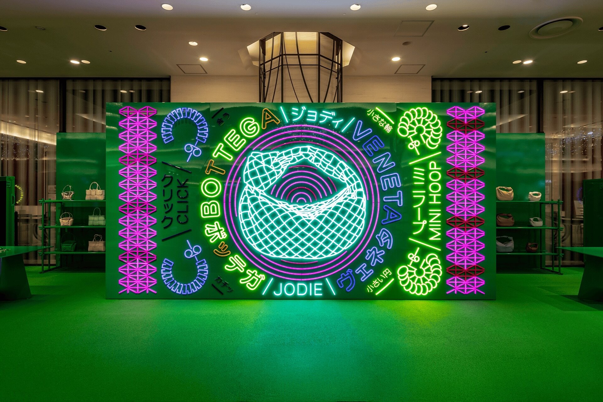
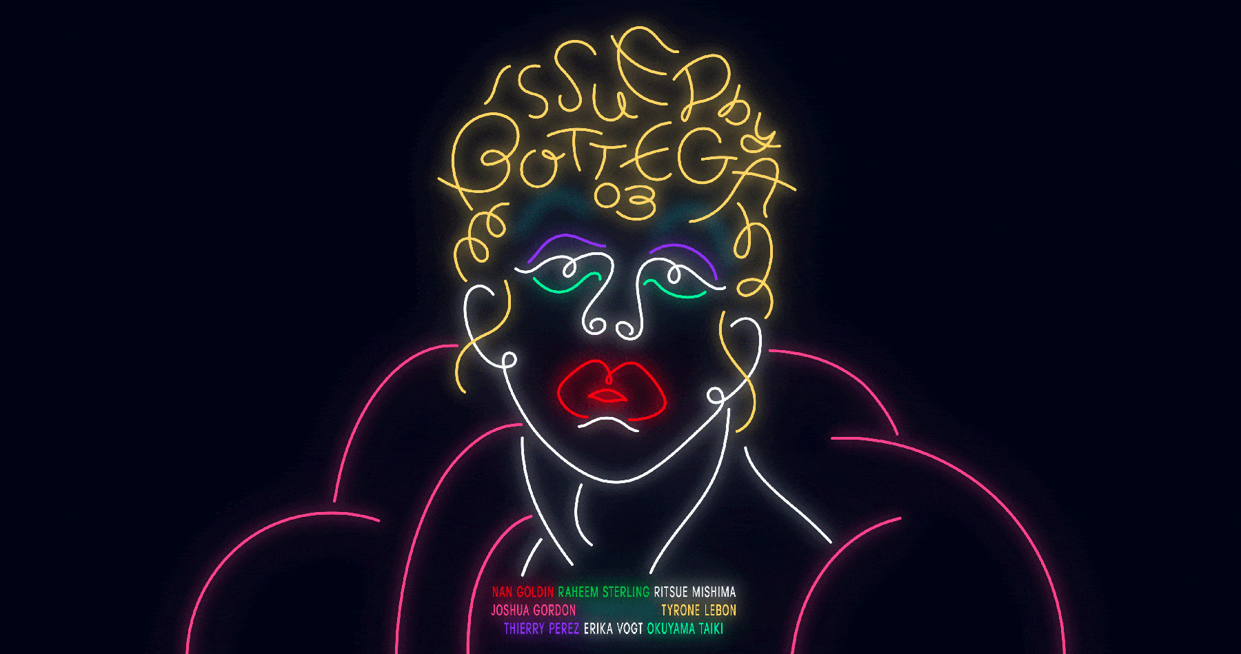
[TOP Image]
BOTTEGA VENETA x Taiki Okuyama
POP-UP “Wardrobe 03” INSTALLATION
2021–2022
Hankyu Umeda 1F
—When we think of your work, we recall the unique visual experiences you create through loop animations and installations inspired by neon signs. What kind of experiences or turning points led you to this form of expression?
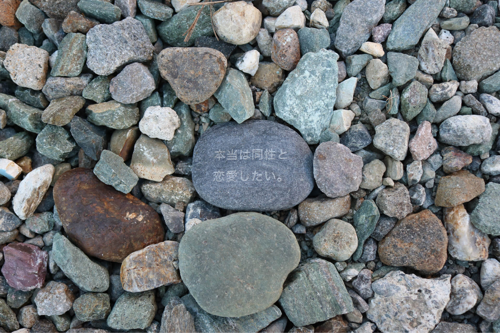
I used to create GIF animations and share them on Tumblr, but at some point, I realized that what I was making was nothing more than the simple flickering of light on a display. That phenomenon reminded me of the neon signs at amusement arcades floating in the countryside landscape I saw as a child.
Those seemingly dynamic signs were, upon closer look, just the blinking of individual neon tubes. As a child, I felt that the dazzling dynamism born out of such minimal repetition was like a beacon connecting the closed-off nights of the countryside to the wider world.
This childhood memory became the starting point for me to create works built solely on the flickering of drawn lines. The repetition of light and dark, much like dance music, evokes both the eternal and the fleeting, creating a sense of euphoria.
—When we think of your work, we recall the unique visual experiences you create through loop animations and installations inspired by neon signs. What kind of experiences or turning points led you to this form of expression?
I used to create GIF animations and share them on Tumblr, but at some point, I realized that what I was making was nothing more than the simple flickering of light on a display. That phenomenon reminded me of the neon signs at amusement arcades floating in the countryside landscape I saw as a child.
Those seemingly dynamic signs were, upon closer look, just the blinking of individual neon tubes. As a child, I felt that the dazzling dynamism born out of such minimal repetition was like a beacon connecting the closed-off nights of the countryside to the wider world.
This childhood memory became the starting point for me to create works built solely on the flickering of drawn lines. The repetition of light and dark, much like dance music, evokes both the eternal and the fleeting, creating a sense of euphoria.
—Do you consciously think about crossing the two domains of “art” and “design”?
I don’t think I’m overly conscious of the difference, since the two are not completely separate.
That said, there are certainly moments when my art director/designer’s perspective comes into play in my work as an artist. The structural sense and information-organizing skills I’ve developed through design are applied in my art practice, while the purity I pursue in form and color through art, in turn, influences my design work. I feel this back-and-forth enriches my overall expression.
Moreover, I believe that “design” is essentially a spin-off of “art.” The processes and methods may differ, but the ultimate destination they both aim for is the same. I think that’s why I find myself moving fluidly between the two domains in pursuit of that goal.
—You will be participating in Roppongi Art Night 2025 this September. Since your work will be exhibited outdoors in a public space from day to night, what kind of message do you hope to convey through this project?
Just as I once felt the neon lights of amusement arcades in the countryside were like a beacon when I was a child, I believe that in urban spaces, too, the artificial flickering of light serves as a presence that connects people and places. Bright, eye-catching flashes of light that can be seen even from afar and in any environment captivate and uplift people. To me, they have come to symbolize the vitality of human activity.
Neon signs have traditionally been used in places like arcades and shops to stimulate desire or incite gambling impulses. By removing them from those purposes, I want them to function as a pure device—nothing more than lines flickering on and off.
A luminous form rises with fleeting yet powerful intensity, its loop of light and dark simply existing there.
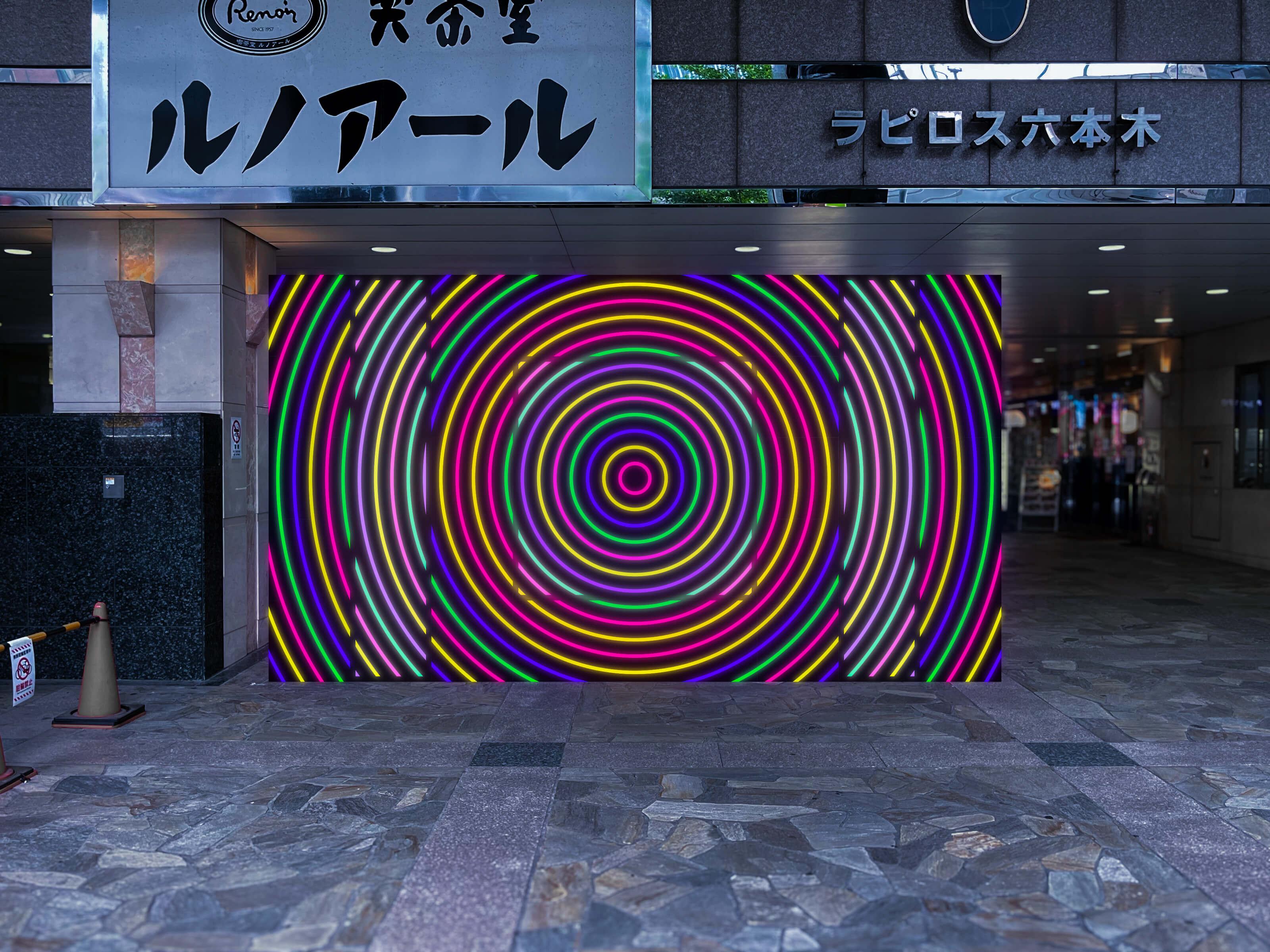
—At Roppongi Art Night, what kinds of experiences or interactions do you hope visitors will have?
This year’s works, Beacon for Crossing and Current Location, will be installed near the entrance to Roppongi Art Night, close to an intersection that symbolizes the city.
In urban spaces, light doesn’t serve merely as decoration—it functions as a landmark. It visualizes the sense of “I want to go there” or “I am here.” Crossing streets and confirming one’s location, moving through the city guided by these signals—this series of actions becomes a prologue to art and the festival, transforming the city’s night into a new temporal experience. I hope the lights shine to bridge the city and art, daily life and festivity, and the unseen boundaries and hierarchies that separate them.
Above all, I just want people to get excited. If possible, I hope they approach the work—they might find a little surprise waiting.
—Could you share a recommended spot where you find inspiration?
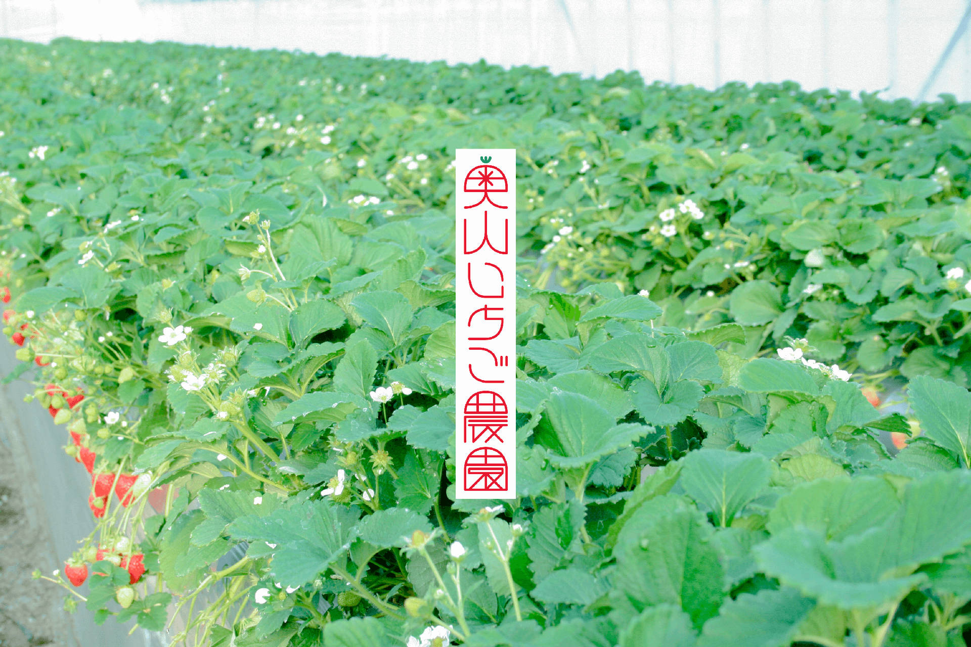
It would be Okuyama Strawberry Farm, run by my family in Okayama.
The changes in color and light I observe in nature connect directly to the sensibilities I apply in urban-based works. For example, the vivid red of strawberries, the green of leaves, and the light reflecting off the greenhouse have all shaped the foundation of my sense of color. The sweet scent of the fruit and its soft forms also share a resonance with the glow of neon lights and smooth drawn lines.
The sky over the reclaimed farmland—a vast, open countryside—shifts dramatically through blue, orange, black, and pink; it could almost be described as theatrical.
While I work with artificial light in the city, the color and brightness sensibilities I gain from nature bring subtle balance. Moving between these two extremes helps me continually update and evolve my expression.
—Are there any new areas of expression or challenges you’d like to pursue in the future?
I want to keep making neon lights sparkle in all sorts of places: on bustling street screens, in unlit rural fields, on tablets on desks, atop skyscrapers, on bedroom walls, in someone’s social media feed, or even on a keychain attached to a bag. From large-scale works that interact with architecture and urban landscapes to pieces that resonate with an individual’s emotions, I want my work to connect with both people and places.
I’m also interested in creating works where the rhythm of flickering light merges with music or performance. I hope to collaborate with a variety of people, going beyond just neon.
I want to temporarily set up moments of celebration within spaces and literally imprint those scenes onto people’s eyes. That’s the kind of moment I want to create.
Above all, I will keep prototyping and experimenting.
Taiki Okuyama
Art Director & Designer / Graphic Artist
Born in 1988 in Okayama, based in Tokyo. While working as an art director and designer in the field of cultural arts, he also creates loop animations and installations as a graphic artist, composed solely of flickering lines inspired by neon signs. He interprets the blinking of light as a symbol of the vitality of human activity, expressing various themes with a highly entertaining approach. He actively collaborates with domestic and international partners. Additionally, he is a strawberry farmer addressing local and agricultural challenges.
Links
Website: https://okuyamataiki.com/
Instagram: https://www.instagram.com/okuyama.taiki/
X: https://x.com/ock_n_roll
Facebook: https://www.facebook.com/taiki.okuyama
Okuyama Strawberry Farm: http://okuyama-ichigo.com/
編集:AWRD編集部